Hello! This is Onodera, a graphic designer.
The Onodera Chiho Design Office is based in Kushiro City, Hokkaido. It listens to the concerns and problems of the local people and carries out designs that are close to the local community.
Because of my connections, I am helping the agricultural information design company in general with full remote help.
Today we will publish the process of creating a logo for the Agricultural Information Design Company.
The current logo was born in 2016. Until then, the logo that Representative Hamada had created was used.

This logo had a good atmosphere, but in order to expand the business, we wanted to update the logo, so we proposed a new design.
First, set target users.
The specific attributes of the services to be delivered to “who” will be listed as concretely as possible. Usually, we proceed on a hypothetical basis, but this time there is a Facebook group called AgriBus-NAVI Tomo-no-kai, which aims to exchange information on AgriBus-NAVI, the main product of Agricultural Information Design Inc., and to interact with users. Since farmers who are users were very active in posting, we selected two people who were particularly active in writing, and extracted their attributes.

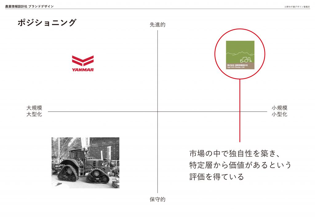
Next, we will use the positioning map to clarify the current standing position.
This is for sharing recognition, so quickly and easily. We reaffirm that our position as an agricultural information design company is based on the leading edge of delivering easy-to-use products by the power of IT, by making them smaller and smaller, rather than the traditional conservative agriculture in which large-scale and large-scale investments can be anticipated.
Next, define the brand concept based on the target user and positioning. Instead of creating a logo all of a sudden, by defining the concept at the beginning, you can return to the “original” and make the visual consistent.
The concept of “expandability scalable” is based on the keywords “logical and rational” derived from target users, and on the keywords of “miniaturization and miniaturization” confirmed in the positioning map, which means “growth through the combination and cooperation of small units.”

Furthermore, based on the concept, we will derive a brand copy (catch copy).
“The “”expandability scalable”” I mentioned earlier is a sentence, and it is “”scalable your farming.”””

Next, I will decide on the brand color.
“Here, we use the matrix “”5 color schemes, image scales”” from the Japan Color Design Research Institute.” This is an excellent product that can change the keyword into color scheme, and we will use this image scale to examine the color scheme.

When we scaled the words (rational, innovative, progressive, and rational) that were similar to the keywords we’ve extracted so far, we found that they were mapped into the “modern” area at the bottom right.
By the way, if the color of the old logo is applied on a scale, it will be converted into a keyword such as “natural, safe and comfortable,” so you can see that the color scheme needs to be corrected to the image you want to come up with.
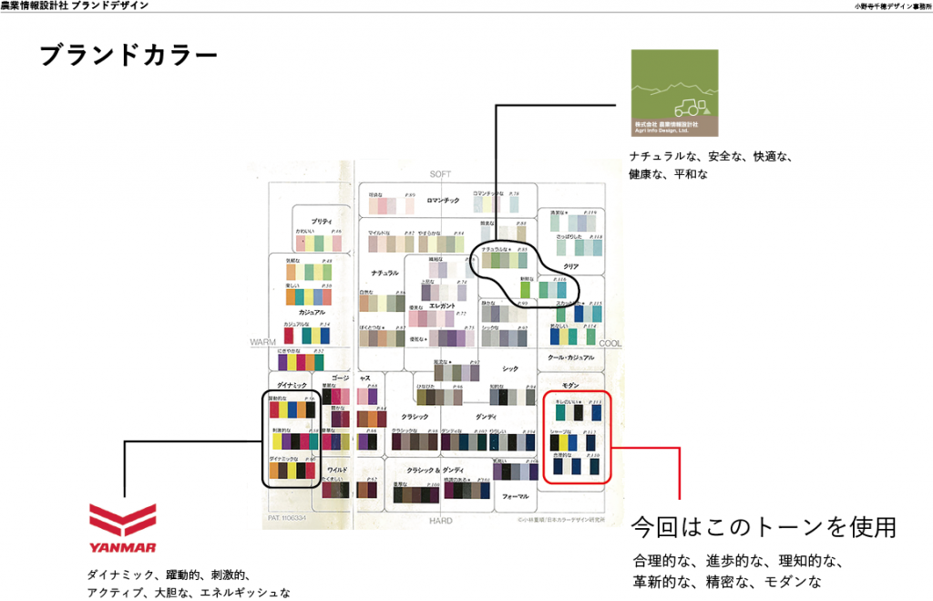
(As a company whose brand image is easy to understand, I have been mapping Yanmar’s logo as well. Yanmar is not a direct competitor, but you can check your position from the color scheme by mapping the competition.)
“Based on the image scale mentioned earlier, we will select the three colors of “”using this combination of colors to unify the brand image.”””

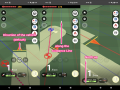
Then I proposed three proposals for the logo. First, Plan A.
“Based on the brand concept of “”expandability,”” this idea was inspired by the patchwork of Tokachi’s fields and the tracks of ridges and tractors.”
We have also created examples of business cards, envelopes, and websites to make it easier to imagine the situation in which the logo was used.


Next is Plan B. “This is a plan that combines the acronym “”Agri Info Design”” in a modern way like a block.”


And draft C. “This is a plan that combines organic relationships among farmers and “”A”” in Agri to create an image.” It’s like a tech company.


Actually, I personally liked the B proposal, but when I discussed it at the video conference between the representative Hamada and the initial member Tanabe, I decided to brush up the A proposal because “I, I, D, and acronyms are not necessary.”
Sometimes I shared my screen with the two of them at video conferences, and I opened the Illustrator files on the spot to subtly adjust the color, asking if I could use a little more of this color. Live design.
The result is the current logo.


Each color also has a role to play.
Green: Expressing Agricultural Products
Blue: Expressing the sky
Yellow-soil: Expressing Earth and Grains

We have made several patterns for the symbol to be used in combination. (The image that the patchwork of the field spreads out by arranging a few)

This time, I wrote about how the logo could be created.
We will continue to develop a variety of designs, so I will write again when I have a theme (if I feel it’s appropriate). Enjoy…
Onodera Chiho Design Office
Graphic designer Chiho Onodera
http://onoderachiho.com/